

Alpha rarely arrives as one heroic discovery. It is more like an ant colony carrying a leaf many times its own size: dozens of small contributions, each unimpressive on its own, somehow producing an impressive result.
Unfortunately, research also resembles an ant colony in another respect. Much of the work involves running in circles.
The first version of a systematic strategy almost never survives unchanged. Every iteration exposes another assumption, another weakness, or another opportunity for a small improvement. Good strategies are not discovered fully formed. They are crafted.
To harvest such incremental improvements, you need a disciplined research process. Following it step by step helps avoid the dangers of overfitting.
Before developing the strategy, let’s introduce the underlying research process.
Research Process
Figure 1 illustrates the research process. Notice that every arrow in Figure 1 eventually points back to an earlier stage. Research is rarely linear. Every improvement uncovers another question.
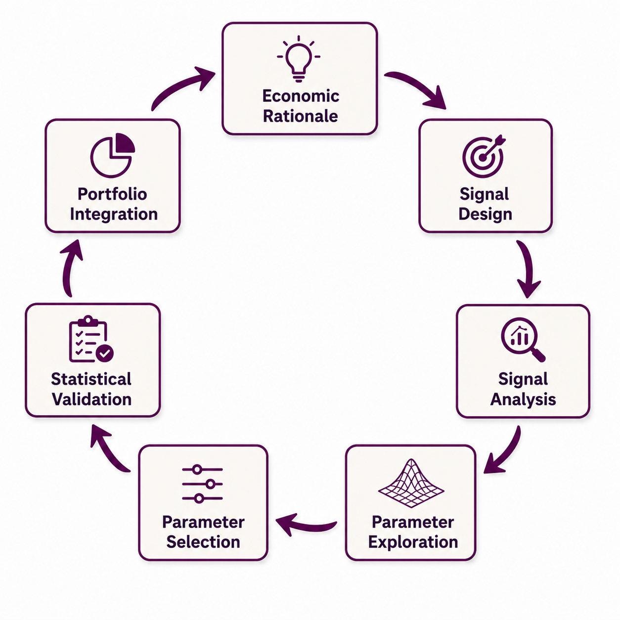
The process is cyclical because every stage may lead to new conclusions. If this is the case, any step may require returning to an earlier one.
The research process consists of seven stages and is influenced by First Principles Thinking.
Economic Rationale
To minimize the risk of overfitting, do not start by crunching data and tuning parameters. Start with a sound economic rationale. Write the rationale down. Make every assumption explicit. You will almost certainly revisit both later.
Every subsequent modification should be justified by the economic rationale. If it does not, discard it. Of course, not every economic rationale will prove correct or be exploitable in a systematic way. Keep the rationale in mind throughout the process. Only make changes to a strategy that are in line with the economic rationale.
To illustrate this phase, let’s turn to a practical strategy: We want to participate in trending assets and formulate an economic rationale.
Economic Rationale
Financial markets continuously process new information about the economy. While news may arrive instantly, its impact on prices often unfolds gradually. Market participants differ in their information, objectives, risk constraints, and speed of decision-making. As a result, capital is reallocated over time rather than all at once. This gradual adjustment creates persistent price movements that can last for weeks, months, or even years. Trend-following does not attempt to predict these movements before they begin. Instead, it assumes that once a persistent adjustment is underway, it is more likely to continue than to reverse immediately.
Signal Design
A sound economic rationale is necessary—but it cannot be traded. The next step is to translate the idea into a signal that can be evaluated objectively.
A signal is a formula that assigns a numerical value to each instrument1 at each point in time. As we are developing a trend strategy for futures on daily price data, we need a signal for every trading day. Other strategies may instead rely on Commitments of Traders (COT) data, intraday data, or alternative data sources.
When defining a signal, it is important to think about potential look-ahead biases. Is every part of the signal data available at every point in time? The signal must not use information about the future. Look-ahead bias often creeps in through surprisingly subtle mistakes.
For example, you may devise a signal that uses GDP data. As GDP data often gets revised after its first publication it is crucial to only use the data that was actually available at the time the signal is created. Another common mistake is to fill missing data by propagating future data backward.
Never do this. Seriously. Always propagate missing data from the last known value forward. If there is missing data at the beginning of a time series and forward propagating is not possible, then set the signal to a neutral value until the first observed value. This popular mistake regularly occurs when calculating standard deviations with a given lookback period.
The value of the signal indicates the conviction in a trading position: You want to be long for high values (perhaps even in a larger position size) and short for low values.
The signal should be constructed so that it is comparable across your tradable universe. For example, in the case of a trend strategy, Bitcoin should not have a higher signal value only because it is more volatile than bonds.
When defining a signal it is important to keep in mind that rapidly changing signal values will result in high portfolio turnover: If a signal switches its value between long and short every day, it might be a very good signal but the strategy becomes impractical to trade due to high transaction costs because of daily rebalancing.
The signal definition should also specify a possible range of parameters to analyze. This range may depend on the economic rationale or available data.
For example, if you want to capture trends there might be an upper bound for the trend length because of economic reasons or simply the length of historical data: It does not make sense to analyze 10-year trends if you only have 5 years of historical data.
To create a signal for our trend-following strategy, we need to identify trends in prices. Mathematically, there are countless ways to identify a trend in a time series: You may fit a regression on the log prices, create a time series model, consult some technical indicators like the relative strength index or do moving-average crossovers.
For reasons of simplicity, we will stick with the well-known moving averages. To be precise, we will use a special variant called exponentially weighted moving average (EWMA). This variant gives more recent observations a greater weight so that the signal will respond more quickly to new information.
Signal Design
Calculate a trading signal for each tradable instrument with the following formula:
\(\mathsf{signal_t = \displaystyle\frac{trend_t(P_t)}{{\sigma_{t}}}\times Vol_t}\)
\(\mathsf{P_t}\): Back-adjusted price series of an asset at time t
\(\mathsf{\sigma_t}\): Price volatility of the asset at time t
\(\mathsf{trend_t(P_t)}\) is a function to calculate the trend strength of an asset at time t:
\[\mathsf{trend_t(P_t) = ewma_{fast}(P_t)-ewma_{slow}(P_t)}\]
\(\mathsf{ewma_{span}(P_t)}\): The exponential moving-average price of the back-adjusted price time series \(\mathsf{P_t}\) with a lookback period of span trading days. The lookback is specified as a span parameter of pandas’ ewm method. The span in Python is defined in a way to make it comparable to the same lookback of a simple moving average. The decay can equivalently be expressed using the smoothing factor \(\alpha\) or the half-life; these parameterizations can be converted into one another. We always set the slow span to four times the fast span to reduce the number of free parameters to choose from.
\(\mathsf{Vol_t}\): Volatility multiplier of an asset at time t. Division of the long-term volatility (smoothed short-term volatility over 20 years) by the current short-term volatility (price volatility of the asset smoothed with a span of 32 days). The value is then percentile-mapped to a range between 0.5 and 2.
Let’s decompose the formulas on an abstract level: The trading signal normalizes the trend strength of an asset’s price \(\mathsf{trend_t(P_t)}\) at time t by its price volatility \(\mathsf{\sigma_t}\) and is then scaled by a time-dependent factor \(\mathsf{Vol_t}\).
Dividing the trend strength by the volatility is called inverse volatility scaling and serves several purposes: As the trend function takes back-adjusted prices as input the trend strength will be dependent on the magnitude of an absolute price movement. These movements depend largely on the volatility of an asset. As the signal should be comparable across assets of different asset classes, this normalizes the signal across instruments.
By dividing by the volatility, an asset like Bitcoin (which is very volatile) can be compared to an asset like the 10-year U.S. bonds.
Additionally, inverse-volatility scaling has another advantage: The signal decreases when trend strength remains unchanged but volatility rises. This way we also get a risk management mechanism built-in for free! As the signal is translated into a position size of our portfolio, the position size will decrease when the same trend becomes riskier. A welcome bonus.
Next, consider the trend-strength function. \(\mathsf{trend_t}\): It is the difference of two moving averages fast and slow. These are two parameters of our signal. The fast component measures the moving-average of a price series with a shorter lookback than the slow component. Suppose an asset appreciated substantially over the previous 10 trading days. Set the fast span to 10 days and the slow span to 40 days. If the asset did not move much the preceding 30 trading days, then \(\mathsf{ewma_{10}}\) will be higher than \(\mathsf{ewma_{40}}\).
\(\mathsf{trend_t}\) will therefore have a positive value and signal a long position. The trend function can be interpreted economically as the short-term price level compared to a longer-term equilibrium price. Positive values signal price appreciation and negative values price declines compared to the equilibrium price. This interpretation directly reflects our economic rationale: the market is still adjusting toward a new equilibrium.
We also need to specify a practical range of the lookback period. This decision is less driven by the economic rationale but more by the available data. Because the tradable universe expands over time, it increasingly includes instruments without data histories extending back to the 1970s.
To preserve diversification, we do not want to wait until every instrument has accumulated several years of observations. We therefore cap the fast EWMA span at 150 trading days, corresponding to a slow span of 600 trading days, or approximately 2.4 years. We set the lower bound of the fast span at two trading days because faster signals would generally produce excessive turnover and transaction costs.
What about the volatility multiplier \(\mathsf{Vol_t}\)?
This scaling factor adjusts the signal strength on a long-term level. Consider the following situation in the aftermath of the financial crisis in Figure 2: Interest rates were artificially suppressed by central banks for the better part of a decade.
Interest volatility was also quite low during that time. The volatility multiplier therefore remained above 1 for much of this period. The trading signal will therefore be higher than normal and increase the position size of the asset in the portfolio to reflect this unusually low-volatility environment.
Signal Analysis
At this stage, we deliberately avoid looking at backtest results. Instead, verify how the calculated signals behave across the tradable universe.
Are there outliers due to data errors or special circumstances? What is the general range of the signals over all instruments? Do they behave similarly across different asset classes? How smooth are the trading signals from day to day?
Many of these checks consist of visual inspection of the signals of different instruments but some aspects can also be checked quantitatively. Any unexpected behavior should be investigated and corrected before proceeding to the next step.
Let’s dive directly into the trend-following example and first have a look at the number of tradable instruments over time in Figure 3. The historical data of the universe starts in June 1975. Back then there were only a few established contracts such as soybean and U.S. Treasury futures.
Over time, the futures market became increasingly diverse. New instruments entered the market; some succeeded, while others, such as pork-belly futures, were discontinued. In aggregate, more and more instruments have been tradable over time.
The continued expansion of the universe constrains the maximum lookback we can evaluate as we want to trade as many instruments as possible. Under our “burn-in” rule, Trend 150 requires 600 trading days of data before it becomes active. The 600-day cutoff represents a compromise between requiring sufficient history and retaining as broad a tradable universe as possible.
To make the trading signal more concrete, consider Figure 4. The figure depicts trend signals with different lookback periods. Lean hogs, for example, had a high value in June 2014 on the long-term Trend 110. That means the shorter-term EWMA was substantially above the longer-term EWMA, indicating strong recent appreciation relative to the longer-term price level.
One year later the trend reversed over that horizon, putting the trading signal in negative territory in June 2015. The three examples showcase another feature of different trend lookbacks: The longer the lookback, the more slowly the whole signal changes. This also implies lower trading costs when actually trading the signal.
To get a better feeling for all trading signals over all instruments we will now turn to Figure 5 and Figure 6. These figures show different values of the trading signal per lookback period over all instruments.
Figure 5 shows the mean absolute signal, the 5th–95th percentile band, and the full minimum–maximum range. You may ask yourself why all values increase as the lookback lengthens.
That is by construction of the signal. The volatility estimate is held constant across lookbacks rather than scaled to the signal horizon. As the lookback lengthens, the potential magnitude of the trend component increases while the volatility denominator remains unchanged. The resulting signal values therefore tend to increase.
This effect could be removed by scaling the volatility more to the length of the lookback period (multiply by \(\mathsf{\sqrt{(slow-fast)/2}}\)).
But what actually matters much more is the smoothness of the mean, percentile, and minimum–maximum bands: In the figure there are no spikes.
Spikes may indicate a flaw in the signal design, a data problem, or an insufficient initialization period. Initialization (“burn-in”) means that the signal is only calculated after a complete lookback window is available. Depending on how your signal is designed, a missing “burn-in” may result in extreme values at the beginning of the time series.
Figure 6 is the first figure that can really embarrass us. If one asset class suddenly produces signal values twice as large as everything else, something is probably wrong—either with the data or with our assumptions. Two asset classes are worthwhile to discuss here: Volatility and Rates.
Both asset classes exhibit more extreme mean absolute signal values than the others. Why?
Rates are relatively straightforward to explain. Our sample begins in 1975 and includes a multi-decade decline in yields. Because many rate-futures prices move inversely to yields, these contracts experienced persistent price trends that produced comparatively strong trend signals.
Volatility requires a different explanation. First, the asset class contains only two instruments—VIX futures in the United States and VSTOXX futures in Europe—so its cross-sectional mean is less stable. Second, I exclude front-month volatility futures because of their elevated risk and instead trade more deferred maturities.
Outside periods of market stress, volatility-futures curves are frequently in contango (upward sloping). When this occurs, deferred contracts tend to decline as they approach expiry and converge toward lower nearby prices, producing negative roll yield. This structural drift can create a stronger trend component in a continuous futures series.
Parameter Exploration
The signal looks plausible, but we still have no idea whether it actually trades well. Only now do we allow ourselves to run the first backtest. But we want to glean as little from the data as possible and not look at full-blown equity curves or drawdown plots.
In general, it is good practice to run as few backtests as possible. A strategy rarely works right out of the gate and needs some adjustments, but you should never get caught in a process of fiddling with different signals.
Remember that if you test hundreds of different signal definitions and end up with one good backtest, you may have created something that fits your data and generalizes very poorly.
Examining the parameter surface helps to avoid this kind of optimization trap. Run backtests for all parameter values and plot the Sharpe ratio (before and after costs) of each resulting backtest. Performance should vary smoothly across neighboring parameter values rather than jump randomly.
The goal is not to find one perfect parameter. It is to combine many good ones that reinforce each other for more stability, robustness and some added diversification. Like an ant colony, we are not looking for one heroic worker but for many that each contribute a little.
This rather theoretical discussion can be made more accessible by looking at the example of the trend-following strategy in Figure 7.
Figure 7 shows the strategy’s Sharpe ratio before and after estimated costs for each fast-EWMA span. As expected, costs reduce performance across the parameter range. The before- and after-cost curves differ by approximately 0.15 Sharpe-ratio points across most lookbacks, reflecting commissions, bid–ask spreads, and roll-execution costs. At the shortest lookbacks, high turnover materially depresses after-cost performance. This effect diminishes once the fast span reaches roughly 10 trading days.
The historical Sharpe ratio then declines gradually as the lookback lengthens. This does not necessarily make slower signals unattractive: they trade less frequently and may diversify faster specifications. More important than maximizing performance at a single parameter value is the smooth shape of the curve. There is no isolated optimum; neighboring lookbacks produce similar results, which suggests that performance is not driven by one narrowly selected parameter.
Figure 8 shows the correlations between strategy returns generated by different fast-EWMA spans. Correlations change rapidly among the shortest lookbacks but approach 100% among the longest. For example, Trend 2 and Trend 10 have a correlation of approximately 46%, whereas Trend 100 and Trend 120 have a correlation of approximately 99%. Longer EWMAs have strongly overlapping weighting kernels and therefore respond similarly to price movements. This supports using a denser parameter grid at short horizons and a coarser grid at long horizons, where additional specifications provide little incremental diversification.
Parameter Selection
This step in the framework determines the range of parameters to trade with the strategy. A visual inspection of the parameter surface helps identify robust ranges. Within this range, an algorithm can select the parameters to trade. The whole process is explained in detail in this article.
This will be the first time we actually look at an equity curve in the whole workflow. But remember: A promising backtest still proves almost nothing.
The algorithm to select the lookbacks to trade suggests the combination of lookbacks 2, 4, 6, 10, 20, 35, 60 and 100 trading days (EWMA fast) with a maximum correlation of 95% between adjacent selected lookbacks. The algorithm was instructed to search a combination of lookbacks between 2 and 100 trading days. The lower bound was selected for added benefit of diversification while the upper bound was selected for a minimum Sharpe ratio of 1.0.
Figure 9 shows the return correlations for the selected lookbacks. Adjacent selected lookbacks are strongly correlated but the correlations drop off rapidly the farther apart two lookbacks are. The algorithm also selects more strategies with short lookbacks than longer ones. That is precisely the reason why many EWMA-style systems use exponentially spaced lookbacks like EWMA 4, 8, 16, 32 and 64.
Until now, we have deliberately avoided the final equity curve. This is not an act of extraordinary self-control. It is an attempt to prevent the backtest from influencing decisions that should be based on the signal’s economic rationale and behavior.
The signal looks plausible. The parameters behave smoothly. No single lookback is exceptional. That is precisely the point. Good colonies do not rely on a single very strong ant.
Now the strategy earns the right to disappoint us.
Figure 10 contains several important observations. The diversified trend-following strategy performs strongly over the full sample, particularly from the beginning of the backtest through the 2008 financial crisis. Performance weakens noticeably thereafter.
Several CTA managers have suggested that the low-interest-rate environment from 2010 to 2020 contributed to the weaker results.
However, this explanation does not fully hold up in hindsight. The post-pandemic inflation shock generated strong trend-following returns, while performance weakened again after 2022 with interest rates staying high.
Other possible explanations include increased competition, changes in market structure, and ordinary variation in the returns of a strategy with an unstable expected return. The evidence presented here cannot determine which explanation, if any, is correct.
Tables 1 and 2 quantify the deterioration. The annualized return falls from 33.39% over the full sample to 14.72% after 2008, while the Sharpe ratio declines from 1.37 to 0.65. The maximum drawdown and maximum drawdown duration are unchanged because the worst episode occurs within the post-2008 sample. Monthly skewness improves modestly.
| Statistic | Value |
|---|---|
| Return after Costs [% p.a.] | 33.39 |
| Sharpe | 1.37 |
| Maximum Drawdown [%] | 66.03 |
| Avg Drawdown Duration [days] | 26.12 |
| Max Drawdown Duration [days] | 1066 |
| Monthly Skew | 0.37 |
| Lower Tail | 1.83 |
| Upper Tail | 1.59 |
| Winning Days [%] | 55.05 |
| Statistic | Value |
|---|---|
| Return after Costs [% p.a.] | 14.72 |
| Sharpe | 0.65 |
| Maximum Drawdown [%] | 66.03 |
| Avg Drawdown Duration [days] | 51.65 |
| Max Drawdown Duration [days] | 1066 |
| Monthly Skew | 0.50 |
| Lower Tail | 2.07 |
| Upper Tail | 1.61 |
| Winning Days [%] | 54.32 |
These results are sobering, but they do not establish that classical trend following is dead. The strong returns during the post-pandemic inflation shock show that the strategy can still benefit from persistent macroeconomic trends. Nevertheless, an after-cost Sharpe ratio of 0.65 may be insufficient for a stand-alone strategy once estimation uncertainty and implementation risk are considered.
Figure 10 also illustrates a familiar lesson that you may have read a thousand times: Past performance is not indicative of future results, especially if you invested in this strategy before 2022.
I see the drawdown after 2022 as an indicator of that. The recovery since May 2025 is encouraging, although it is too early to determine whether it represents a lasting improvement.
This baseline model has not failed spectacularly. That would almost be easier. Instead, it has failed politely: returns remain positive, the economic rationale remains plausible, and the performance is just mediocre enough to be annoying.
We therefore return to the research loop and ask a narrower question: where has the deterioration occurred?
Finding an Alternative
To get a better handle on the problem, it is advisable to try to find a reason for the declining performance.
As can be seen from Figure 10 the problem cannot be attributed to a specific asset class. It also is not associated with specific futures contracts, like newer contracts.
The quants over at Quantica came up with an interesting analysis in a recent article: They concluded that the performance of trend-systems degraded somewhat for shorter lookbacks beginning 2023.
This observation holds true for our strategy and tradable universe as can be seen in Figure 11.
How can this situation be interpreted economically? The economic environment of 2023 and later was especially influenced by uncertainty in the energy markets because of wars (Ukraine and Iran), changing tariffs between large economic blocs (United States, Europe and China) and hopes of productivity miracles due to the AI boom.
All these factors result in higher volatility and regular repricing of assets.
High volatility may indicate that the market is processing information and moving between price regimes more rapidly. In such an environment, the fixed slow EWMA can remain anchored to observations from an increasingly irrelevant regime. The resulting trend signal then compares the current price with a stale reference level and may remain active long after the original repricing has ended.
Shortening the slow EWMA when volatility rises allows the reference price to adapt more rapidly. This causes signals generated by isolated shocks to decay sooner, while persistent price movements continue to produce directional exposure.
This hypothesis suggests that the original economic rationale is incomplete. It assumes not only that price adjustments persist, but also that historical price observations remain relevant for a constant amount of time. If the speed of market adjustment varies with volatility, the reference horizon of the signal should vary as well.
Extension of the Economic Rationale
Financial markets do not process information at a constant speed. During stable periods, economic conditions and expectations often change gradually, allowing historical prices to remain relevant for relatively long periods.
During periods of elevated uncertainty, expectations are revised more frequently and prices are repriced more rapidly. Older observations may then reflect economic assumptions that are no longer representative of current conditions.
Volatility is therefore interpreted as an observable indication of the pace of market adjustment. When volatility is elevated, the useful lifetime of historical price information may be shorter; when conditions are stable, older prices may remain informative for longer.
This rationale leads directly to a modified signal design. The fast EWMA remains responsible for measuring the recent price level, while the span of the slow EWMA is shortened when current volatility is high relative to its longer-term level. The reference price therefore adapts more quickly precisely when historical observations are assumed to lose relevance more rapidly.
Updated Signal Design
Update the trend component of the original formula with this specification:
\[\mathsf{trend_t = ewma_{fast}(P_t)-ewma_{adaptive}(P_t)}\]
\[
\mathsf{adaptive = min(1.0, Vol_t)\times slow}
\]
\(\mathsf{adaptive}\) is a dynamically adjusted slow span depending on the current volatility of each asset. Because \(\mathsf{Vol_t}\) is mapped to the range 0.5–2.0, the adaptive slow span can fall to half its baseline value when current volatility is unusually high.
This rule introduces no independently optimized parameter. It reuses the existing volatility multiplier as an indicator of the current volatility regime. Additional parameters would increase the risk of overfitting and should be avoided unless they have a clear economic justification.
With an updated economic rationale and an updated signal, the research process continues at step 3, where the resulting signal is analyzed for any anomalies.
The first result is visible in Figure 12 before we run another backtest: the signal distribution contracts compared to the baseline model in Figure 5, particularly at longer lookbacks. Why? When volatility shortens the slow EWMA, the fast and slow reference prices cannot drift as far apart.
The signal plot also shows no spikes or any other abnormal behavior, so that we can resume the next stage of the research process: parameter exploration.
The result is shown in Figure 13. The adaptive version of trend-following improves the after-cost Sharpe ratio by approximately 0.05 points across most lookbacks.
The result is encouraging. The improvement is small but remarkably consistent across the parameter range. The adaptive strategy’s Sharpe-ratio profile is smooth and runs almost parallel to the baseline profile.
We can therefore proceed directly to parameter selection.
The selection algorithm adds the lookback 3 in addition to the lookbacks of the baseline model. In total, the following lookbacks are selected: 2, 3, 4, 6, 10, 20, 35, 60 and 100 trading days for EWMA fast. Remember that Trend 100 now uses an adaptive lookback for EWMA slow. Its default value is 400 and can go down to 200 trading days when the volatility is very high.
Figure 14 compares the equity curves of adaptive trend and the baseline model. There are almost no extended periods in which the adaptive strategy underperforms the baseline. It is slightly better most of the time.
Unfortunately the adaptive version also does not eliminate the extended drawdown that began in 2023, although it slightly reduces its magnitude.
Table 3 shows some performance statistics over the whole backtest period from July 1975 through July 2026. Table 4 compares the baseline strategy to the adaptive version for the timeframe beginning January 2008.
The comparison since 2008 is particularly informative. The adaptive version is still slightly better in nearly every regard. But the improvement is small.
The result is encouraging rather than revolutionary. Across most lookbacks, the adaptive version adds approximately 0.05 Sharpe-ratio points after costs. The two parameter profiles are almost parallel.
| Statistic | Value |
|---|---|
| Return after Costs [% p.a.] | 35.30 |
| Sharpe | 1.44 |
| Maximum Drawdown [%] | 64.99 |
| Avg Drawdown Duration [days] | 24.48 |
| Max Drawdown Duration [days] | 1066 |
| Monthly Skew | 0.41 |
| Lower Tail | 1.78 |
| Upper Tail | 1.60 |
| Winning Days [%] | 55.14 |
| Statistic | Baseline | Adaptive |
|---|---|---|
| Return after Costs [%] | 14.72 | 15.97 |
| Sharpe | 0.65 | 0.71 |
| Max. Drawdown [%] | 66.03 | 64.99 |
| Avg DDD [days] | 51.65 | 46.87 |
| Max DDD [days] | 1066 | 1066 |
| Monthly Skew | 0.50 | 0.60 |
| Lower Tail | 2.07 | 1.98 |
| Upper Tail | 1.61 | 1.62 |
| Winning Days [%] | 54.32 | 54.05 |
This is not the sort of improvement that produces an exciting marketing presentation. It is exactly the sort that can matter in a systematic research process: small, broad, economically motivated, and not dependent on one fortunate parameter.
Statistical Validation
The next phase of the research process is primarily a validation step. The strategy is then subjected to several statistical procedures such as sensitivity analysis of costs, delayed execution, walk-forward analysis, time stability tests, significance tests, and return simulations.
All statistical tests have to be interpreted with a grain of salt because financial markets are inherently non-stationary. Unfortunately, no statistical test can prove that a strategy will continue to work. They can, however, invalidate a strategy.
The analysis of costs plays an important role in making sure, that a strategy does not only work in typical conditions but also in times of market stress. During periods of market stress not only liquidity may dry up but trading may also become very expensive due to widening of bid/ask spreads.
In a worst-case scenario you have to pay the full bid/ask spread each time you change a position in your portfolio. That may occur due to entering or closing new positions or if one future contracts get close to expiry and has to be rolled over. In addition you have to pay commissions.
Analyzing the costs of a stand-alone strategy is a conservative measure, because costs typically come down due to less trading if you combine several strategies where some trading signals cancel each other out.
For the adaptive trend strategy, the cost analysis is straightforward: As already discussed on Figure 7, the costs for the strategy are about 0.15 Sharpe. A doubling of the costs to 0.3 Sharpe is also tolerable over the full backtest but becomes critical after 2008 where the performance drops.
The next check will be related to implementation risk. If you run a fully automated systematic futures strategy there is always the risk of something going wrong. The connection to the broker may get lost, power outages, problems at the broker or simply bugs in the software.
On a strategy level, this results in orders that the systems wants to do but where the system does not get a fill. With the adaptive trend strategy orders will be generated every day. If some orders of the prior day did not get filled the system will generate it signals as usual the next day, compare the wanted positions with the current portfolio and place the needed orders.
If something went wrong the prior day the missing orders typically will be executed the next day (if the signal stayed the same). Any errors will result in delayed execution. The strategy can be subjected to different delays in execution to get a feeling about its sensitivity to execution time of the orders.
Figure 15 shows the loss of Sharpe ratio when delaying the orders of the strategy by up to 5 trading days. As the strategy trades quite slowly the performance decrease is relatively small with low sensitivity. That for sure does not pose a problem if unreliable infrastructure, software or the broker does not execute trades a few times a year. Nevertheless, the graph also shows that you should not go on vacation for an extended period of time without monitoring your system.
The next check will be concerning the stability of the model parameters over time with a walk-forward simulation. Think of this as forcing your younger self to make today’s decisions without knowing tomorrow’s data. Once a year parameters (like the mix of lookbacks or the calculation of turnover for each instrument to decide which lookbacks to trade with each instrument) are recalibrated and then traded for a year.
This process is simulated so that the recalibration process gets all data available up to a that year, then a yearly recalibration with extended historical data is done and the next year is subjected to a backtest. The recalibration process starts in 1985 to at least have enough data for a few instruments and then evaluates year by year.
The results can then be compared to the full sample backtest of Table 1. The results are shown in Figure 16.
Interestingly the yearly re-calibration selects very similar parameters even in the beginning of the backtest. In later years they are mostly identical to the full-sample backtest because the extending window of data stabilizes the results more and more.
On average the walk-forward results are 0.05 Sharpe ratio points worse than the full in-sample fit. The performance loss is so small, that this strategy has only minor estimation risk.
Figure 17 shows the stability of the Sharpe ratio of the strategy over time. We already discussed earlier the noticeable drop in performance beginning 2008 and the additional drop in 2022. Should you be concerned about this drop in performance?
To answer this question, we bootstrap the Sharpe ratio over the full sample, since 2008 and since 2022. We use a one-sided stationary block-bootstrap to test, whether the annualised after-cost Sharpe ratio exceeds zero.
A block bootstrap does not draw individual daily returns independently. Instead, it resamples consecutive blocks of returns. A mean block length of 20 trading days is used. The block bootstrap has the advantage that the structure of autocorrelated returns (like in trend following) is preserved. The block length of 20 was chosen to approximately reflect the dependence horizon induced by the strategy’s typical holding period.
This statistical technique can also answer whether the expected after-cost Sharpe ratio is positive. (null hypothesis H0 Sharpe ratio zero or negative, H1 positive Sharpe) at the chosen significance level of \(\mathsf{\alpha = 5}\)%. The result is shown in Table 5.
The estimated Sharpe ratio differs substantially across the three sample periods, suggesting that the strategy’s performance has changed over time. While the true Sharpe ratio of the full sample lies between 1.13 and 1.70, the upper bound of the Sharpe ratio of the sample beginning 2022 comes in at 0.99.
The confidence intervals indicate a substantial deterioration in estimated risk-adjusted performance after 2022. While the full sample supports a strongly positive Sharpe ratio, the post-2022 sample no longer provides sufficient evidence that the expected Sharpe ratio exceeds zero.
| Period | Sharpe | Lower | Upper | H0 |
|---|---|---|---|---|
| 1975–2026 | 1.44 | 1.13 | 1.70 | reject |
| 2008–2026 | 0.71 | 0.25 | 1.21 | reject |
| 2022–2026 | -0.02 | -1.13 | 0.99 | accept |
The sample beginning in 2022 even accepts the null hypothesis (that the Sharpe ratio is zero or negative) at the significance level of 5%. It therefore cannot infer that the performance is positive.
All this does not invalidate the strategy but should raise some concerns. A strategy like this might get a place in the portfolio but must not be overweighted for sure.
The last statistical test is concerned with the creation of the strategy. As mentioned earlier, it is not advisable to test many different signal designs. You may just arrive at a good signal by chance. Of course this cannot be completely avoided, because you have to test something.
During strategy development, several economically motivated signal specifications were evaluated. Selecting the best-performing specification after observing the historical data introduces data-snooping bias because the final model is chosen from a larger candidate set.
How did that process work in the creation of the adaptive trend strategy?
In total I tested four different signal designs. The main idea was to add the adaptive lookback to the strategy. My first instinct was to shorten both moving averages. It barely changed the results. That failure turned out to be useful because it suggested that the problem was not reacting too slowly to new information, but forgetting old information too slowly. To check the results, I also added it exclusivly to EWMA-fast (also had no material effect the result).
Conventional significance tests evaluate only the final selected model and therefore ignore the fact that several competing specifications were explored. Hansen’s SPA test explicitly accounts for this research-selection process by evaluating all candidate strategies jointly.
The null hypothesis states that none of the tested specifications possesses positive predictive ability after accounting for model selection. Unlike ordinary significance tests applied only to the final strategy, the SPA test adjusts for the fact that several competing specifications were considered during the research process. The results are shown in Table 6.
| Signal | Sharpe |
|---|---|
| Baseline | 1.37 |
| Adaptive Fast+Slow | 1.37 |
| Adaptive Fast | 1.35 |
| Adaptive Slow | 1.44 |
| SPA p‑value | 0.028 |
Portfolio Integration
The last step in the research workflow is to incorporate the developed strategy into a portfolio of strategies. A simple portfolio can be constructed using fixed portfolio weights or fixed risk allocations.
Another possibility is a more quantitative approach using some form of portfolio optimization. Because this is a complex topic in its own right, it is not covered in this article and we stick to simple portfolio weights for now.
Each strategy is categorized as either “trend” or “mean reversion”. Strategies of the trending type profit from diverging prices (either growing or falling) while mean reverting strategies profit from prices returning to some mean value. These two types have very different correlations among each other.
The categorization is done to have some finer control over the number of strategies in each category. The trend category has a weight of 60% and the mean reversion category of 40%. Within each category the strategies are equally weighted. If “trend” consists of 5 strategies, then each strategy gets a final weight of 12% (60% x 20%).
The correlations between all strategies of the portfolio are shown in Figure 18.
There are two distinctive clusters of correlations between the strategies of type trend and of type mean reversion observable. Each cluster has higher correlations within the cluster. The adaptive trend strategy also has high correlations with three other trend strategies of over 90%.
Nevertheless each strategy plays its role in the portfolio like an ant in an ant colony. This particular ant (adaptive trend) increases the Sharpe ratio of the whole portfolio by a small amount of 0.08. Not great, but also nice to have!
Conclusion
We set out to build a trend-following strategy from first principles, and first principles delivered — just not a miracle. The economic rationale held up under scrutiny. The signal behaved itself. The parameter surface was smooth, and the walk-forward tests were boring, which in this line of work is the highest compliment a number can receive. All this back and forth produced a modified strategy better by about 0.05 Sharpe-ratio points by itself and 0.08 to the portfolio as a whole.
That is, by any honest measure, not very much. It won’t headline a pitch deck. It won’t make anyone’s year. What it will do is sit quietly in a portfolio next to a dozen other unglamorous improvements — each one small enough to look like rounding error, each one earned the hard way: a rationale written down before a single backtest ran, a signal checked for spikes before it was checked for profit, and a fix that survived a test built specifically to catch researchers fooling themselves.
That, in the end, is what crafting a strategy actually looks like. Not a lightning bolt of insight, but an ant colony’s worth of small, unglamorous contributions — most too modest to notice on their own, all moving in roughly the same direction, and every one of them still running in circles somewhere, waiting for the next iteration to prove it wrong.
Footnotes
-
In this article a future trading a particular underlying asset is called an instrument. There are cases where the same asset is traded as two different instruments, like trading two different sizes of the same underlying (like mini and micro contracts).↩︎